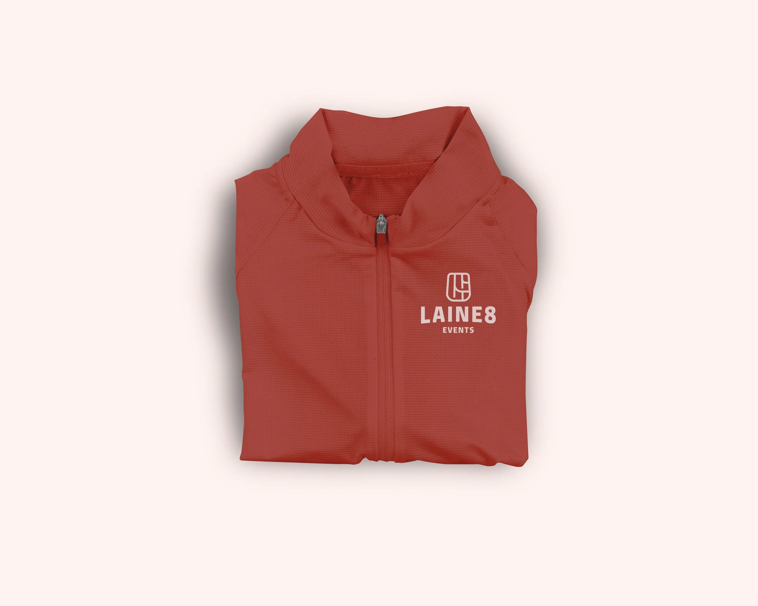
LAINE8 EVENTS | BRAND IDENTITY
Laine8 is the product of a dynamic duo’s experience, passion and dedication for bringing sport events to people everywhere. As a new brand, Laine8 needed a visual identity that would establish their position as fresh, professional and accessible event provider.
Positioning themselves as robust partners for charity businesses and engaging hosts for their participants, at the heart of each event. The goal of this collaboration was to provide Laine8 with a comprehensive branding project and amplify its ethos thorugh an illustrative, professional and premium design.


THE
LOGO MARK
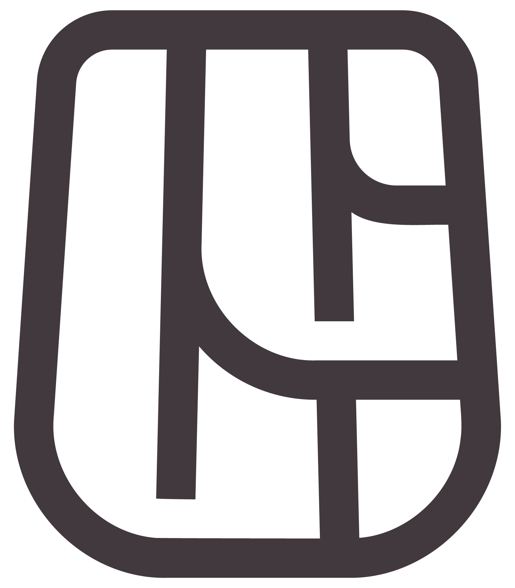
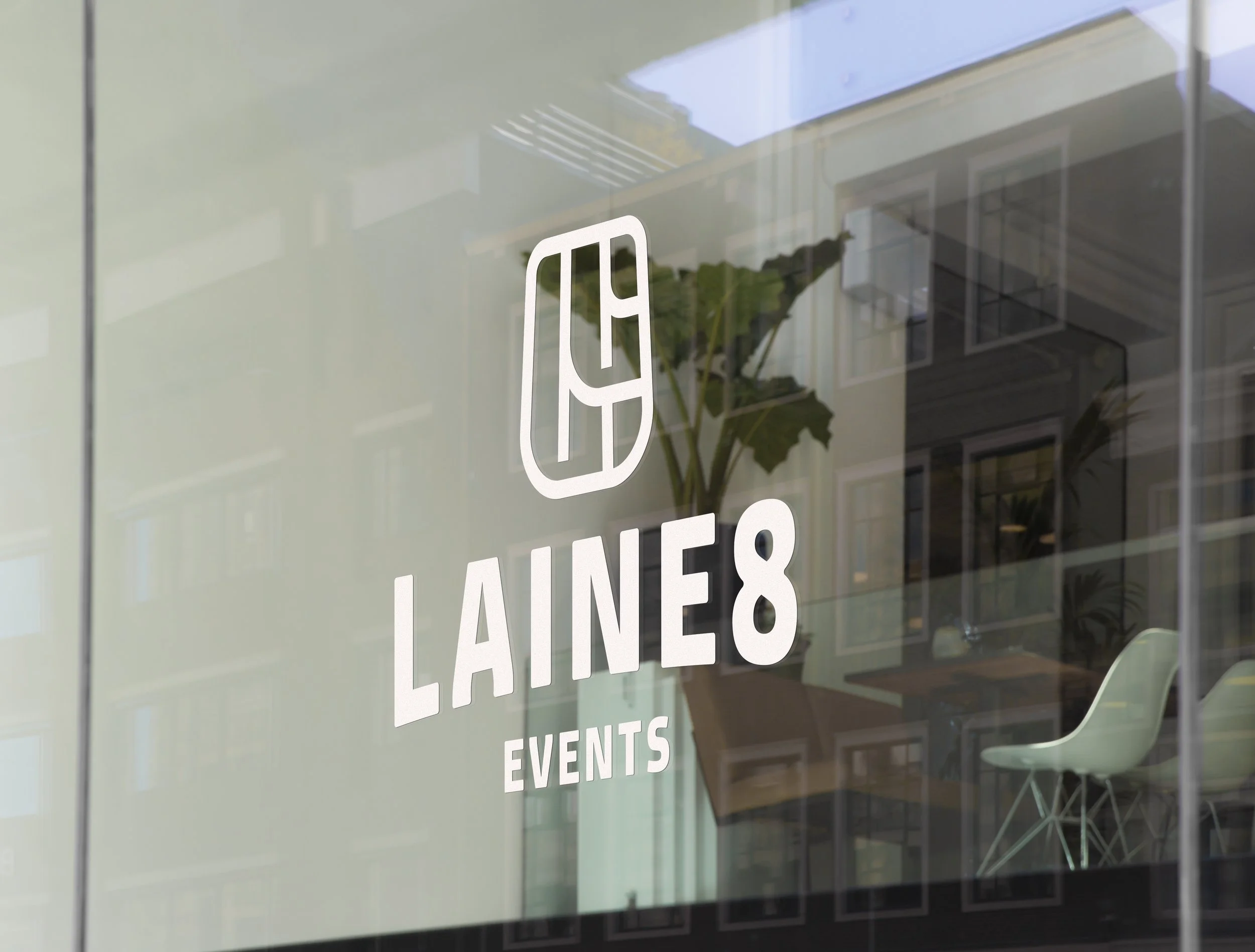
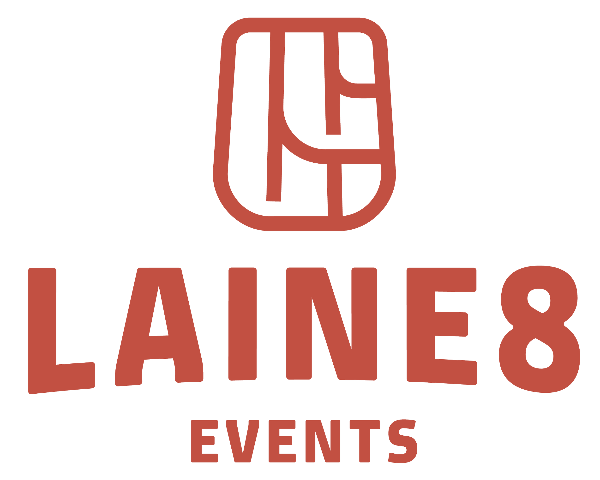
AN EMBLEM OF SUCCESS
At the end of every finish line is a medal. A token of the effort, dedication and engagement at the heart of each event.
The Laine8 mark is an emblem of all those elements. A logo that represents not just Laine8 as a business but the team and community that it serves. A symbol “of sportspeople, by sportspeople, for sportspeople”.
LOGO DESIGN BREAKDOWN

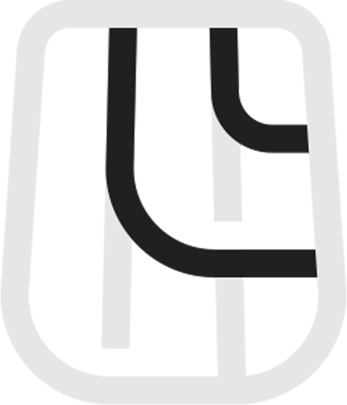
THE OUTLINE
Designed to embrace and encompass, this outline is a symbol for the value of inclusivity and community spirit at the foundation of Laine8. It’s distinctive shape makes it stand out, whilst resembling badges universal to sporting.
THE LA(I)NE
A visual trace for ‘Laine’ - a word historically tied to Sussex, once used to delineate territories measured in 1/8th of a mile. The fluidity of the curve is a nod to the famous Brighton Laines that wind through the city.
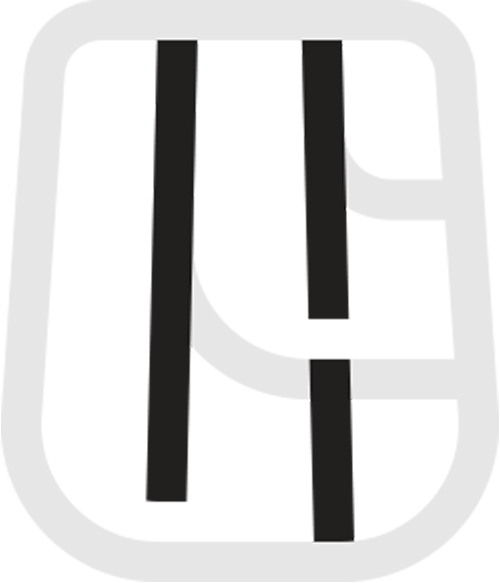
OUTSIDE TRACK LANE
Center stage of the logo is the outside track lane - the eighth lane. Its synonymous with the challenge of running on this lane, with spacing designed to convey forward movement and speed.